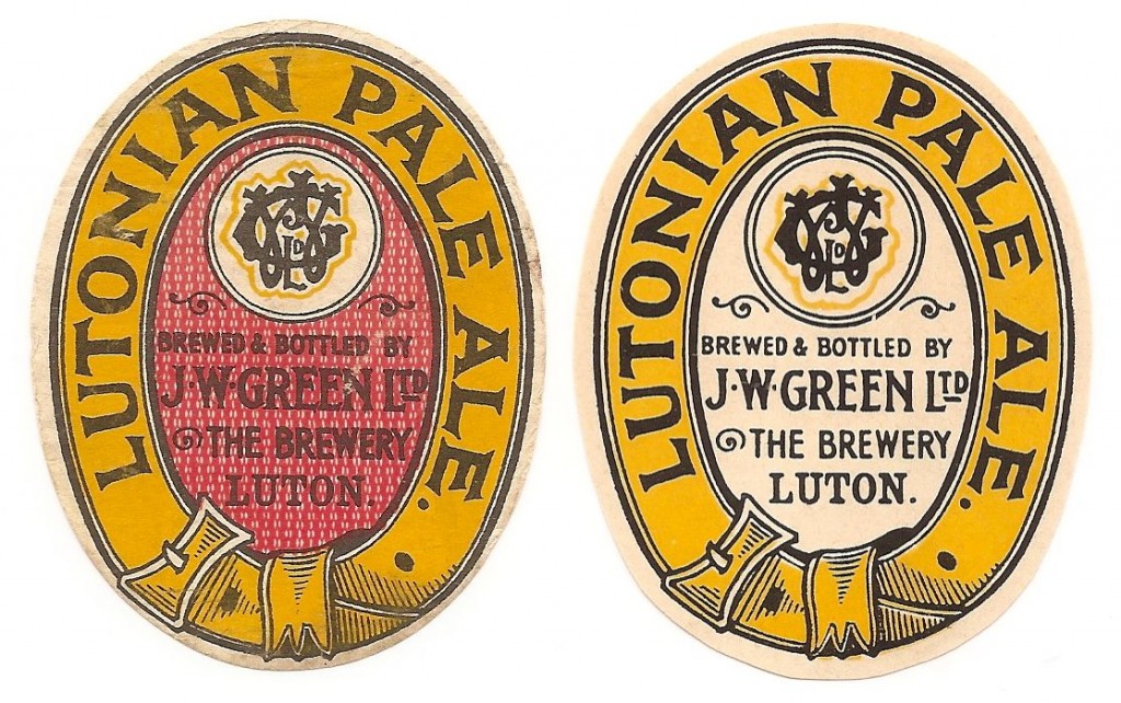
We thought we would highlight the addition of the Green labels to our featured brewery section by returning to the spot the difference theme.
A completely different printing or a colour error? I prefer the right example, no distracting red.

We thought we would highlight the addition of the Green labels to our featured brewery section by returning to the spot the difference theme.
A completely different printing or a colour error? I prefer the right example, no distracting red.

© 2024 - The Labologists Society
3 Comments
14 January, 2015
at 7:37 pm
These are good. I prefer the one on the right too. And I wasn’t getting at the good people who run this magnificent site when I brought up beer label snobbery. I was wondering why so few other people felt able to contribute, surely others are able to get images of their labels. Perhaps those with the best collections don’t feel it necessary to look at the site very often.
16 January, 2015
at 8:55 am
Both are very nice labels. The one on the right without the ‘red’ could just be a printer’s error in that they simply failed to overprint the final colour, i.e. the red. I wonder how common the label without the red is as if it is much more rare than the with red label this would indicate ‘printer’s error’ as its origin. Any one out there got any information? Personally, I only have the with red version in my collection and have never seen the without red version.
17 January, 2015
at 3:28 pm
Well I reckon it is a different label, not an error. My logic is as follows a different plate would be needed for the red pass & it is not a solid colour, it has the small ” ” ” ” ” marks, hence this was an intentional design element and thus the label on the right is different to that on the left. Having said that I prefer the one on the left